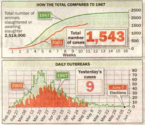
The Times graph on Foot and Mouth disease (May 4, 2001). Only 5 times as many animals killed but still not as bad as 1967!
A classic on how you can use a deceptive figure (outbreak numbers) to deceive. For one thing the farms have decreased by a huge factor from 1967, perhaps by at least 4 times. The average reader not in an FMD area (ie 99%) would be deceived by this graph.